
Through research, I found that while India’s EV market is growing, most brands are positioned as luxury or premium products. Compact EVs for middle-class urban commuters and new families are missing from the market. Families with 1–2 children, especially those in the middle-class segment, are looking for:
- A budget-friendly car under ₹10 lakh
- A range of 300+ km on a single charge
- Comfort and practicality for daily urban commutes
Existing brands either do not meet these requirements or fail to present themselves as approachable and comforting. Instead, they are perceived as aspirational luxury products rather than everyday family cars. This gap showed the opportunity to build a brand identity that feels approachable, modern, and community-driven — an EV brand “for the people.”
Research & Insights
- Studied the Indian EV landscape (Tata, MG, Mahindra, Hyundai, etc.) and found that compact EVs with family-friendly positioning are rare.
- Identified user personas: young professionals, nuclear families, eco-conscious city commuters.
- Insight: Affordability + Range = Trust. Unless both are addressed, people hesitate to shift to EVs.
- Visual identity inspiration: Skoda (for its clean, structured, and people-oriented branding).
I also studied how global EV brands often look futuristic but cold. I wanted Folkshift to feel human, organic, and community-first, while still carrying modern design aesthetics.
Design Process
- Naming: The name Folkshift was chosen to represent community, change, and the way people move together.
- Logo: Designed to be clean, simple, and adaptable across car branding, digital applications, and physical products.
- Visual Identity:
- Colors: Natural and organic tones to give both warmth and sophistication.
- Typography: Minimal yet approachable fonts that are highly legible and friendly.
- Brand Voice: Inclusive, people-focused, aspirational but not intimidating.
- Brand Applications:
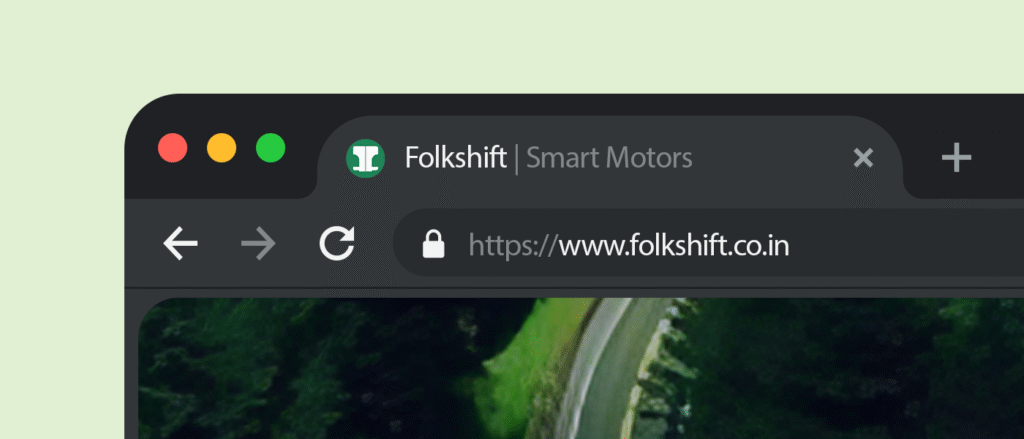
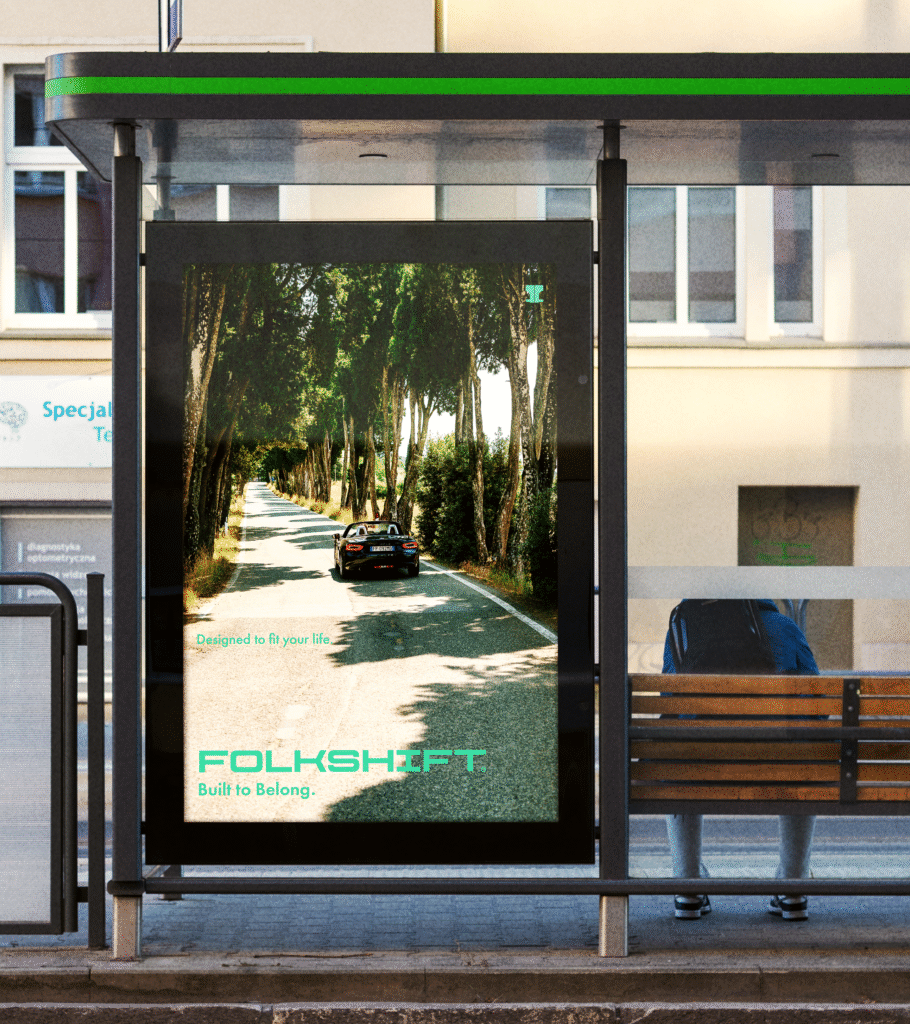
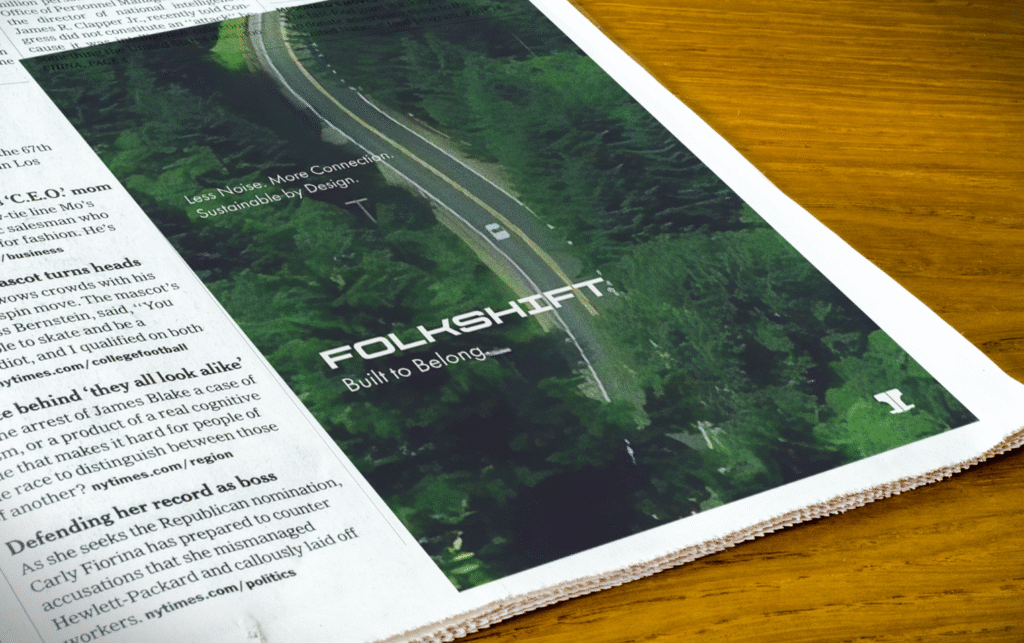
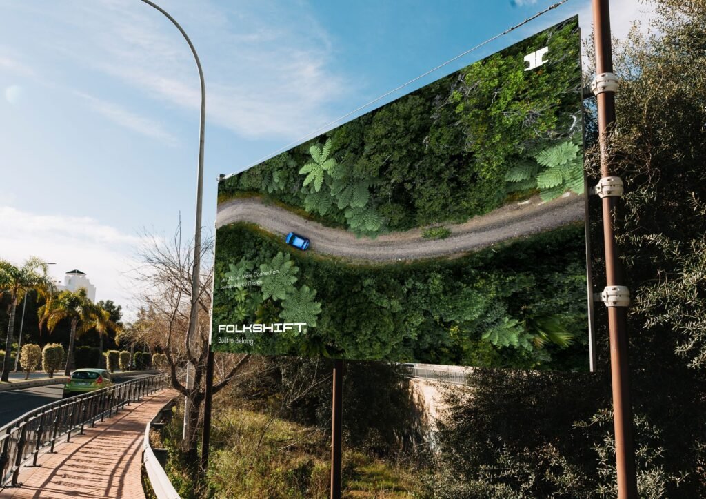
- Logo across car mockups, charging stations, and marketing collaterals
- Brand book with guidelines for typography, color usage, tone of voice, and layout systems
- Social media and ad mockups to test consistency
- Sketches were first done on paper to explore multiple directions before finalizing digitally.
Final Outcome
- A complete brand identity system with logo, visual language, and guidelines.
- Mockups of cars, collaterals, and brand applications.
- A brand book documenting the identity system and usage rules.
- The identity balances modern EV aesthetics with an organic, people-centered tone — making Folkshift feel approachable and trustworthy, unlike the premium-heavy positioning of existing EV brands.
Reflection
This project taught me how branding goes beyond just visuals — it is about positioning, emotion, and the promise a brand makes to its audience. The biggest challenge was to balance affordability and community warmth with a modern and futuristic appeal.
I also realized that naming and narrative are as important as design — the name Folkshift itself shaped the direction of the entire identity.