I studied several books on Mohammed Rafi and also some on other singers to compare how stories were told. The common issue was lack of design balance — bad hierarchy, poor placement of images, and not enough breathing space. I noted down qualities of Mohammed Rafi like humility, versatility, emotional depth, and timelessness, which guided my design choices. I used the content of one existing book, Mohammed Rafi – Golden Voice of the Silver Screen by Sujata Dev but restructured and optimized it for better storytelling.
The book is arranged in chronological order with three sections — Early Life, Tuning In, Echoes of Stardom.
Page size : 8*8 inch
Margin : 0.5 inch
Grid : 6*6 modular grid
Gutter space : 0.1667 in
I chose The Seasons and Garamond typefaces which I found calming to reflect Rafi’s voice and personality. Headlines use The Seasons typeface to bring character to each section and chapter. Garamond was used for all Body texts.
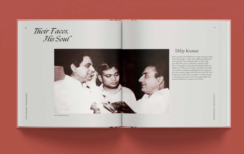
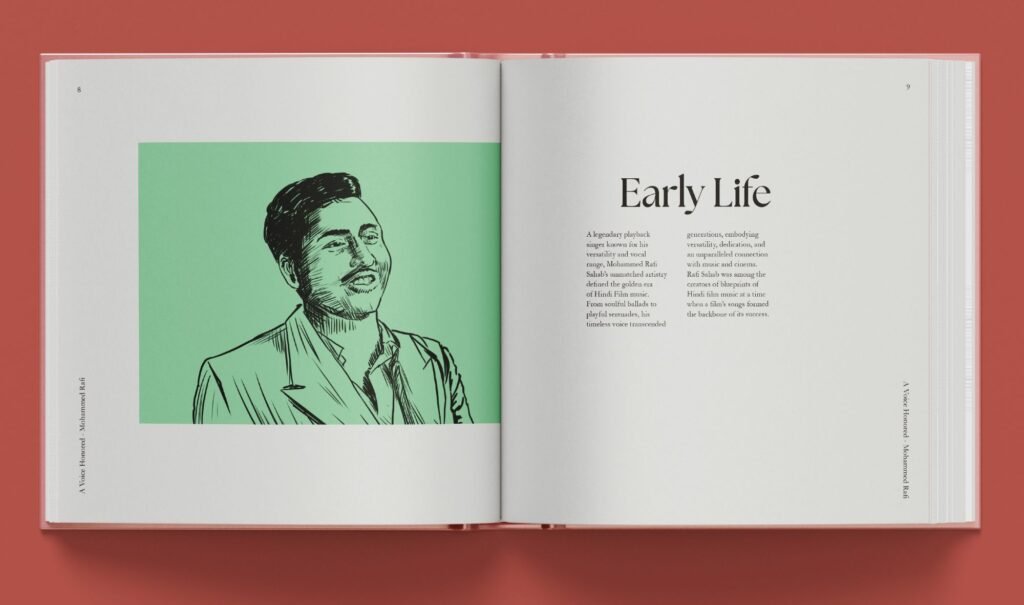
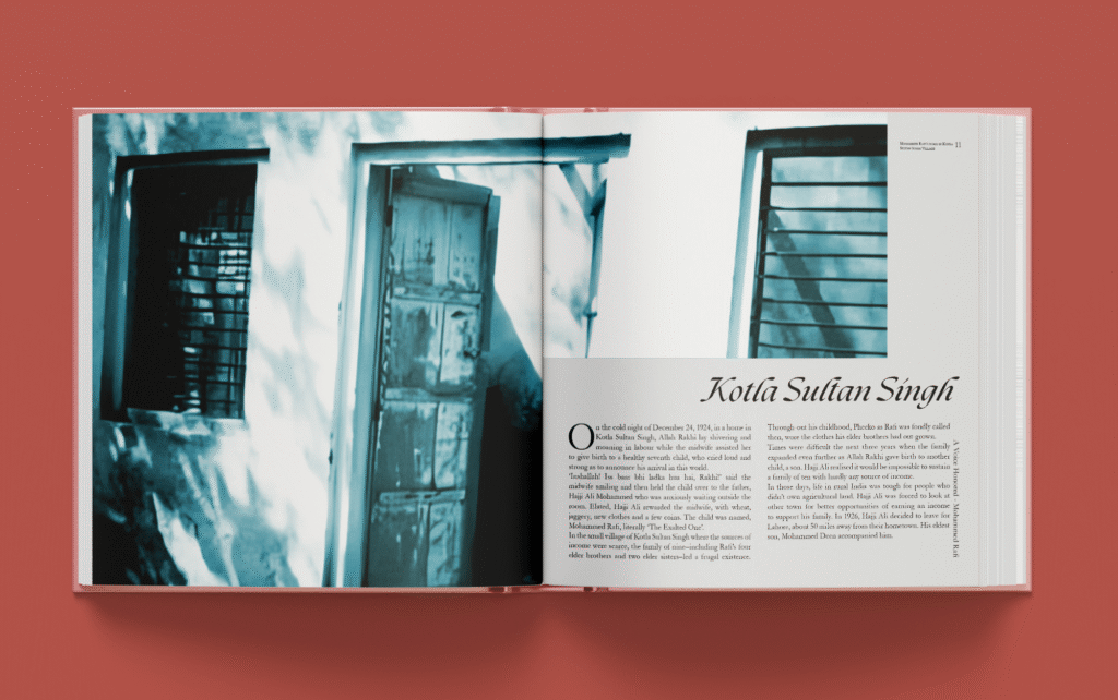
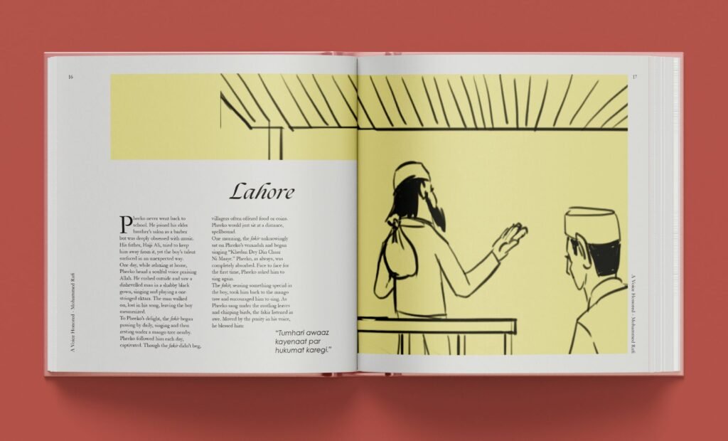
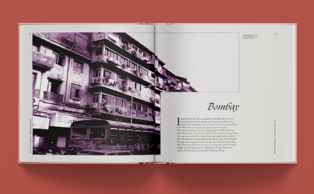
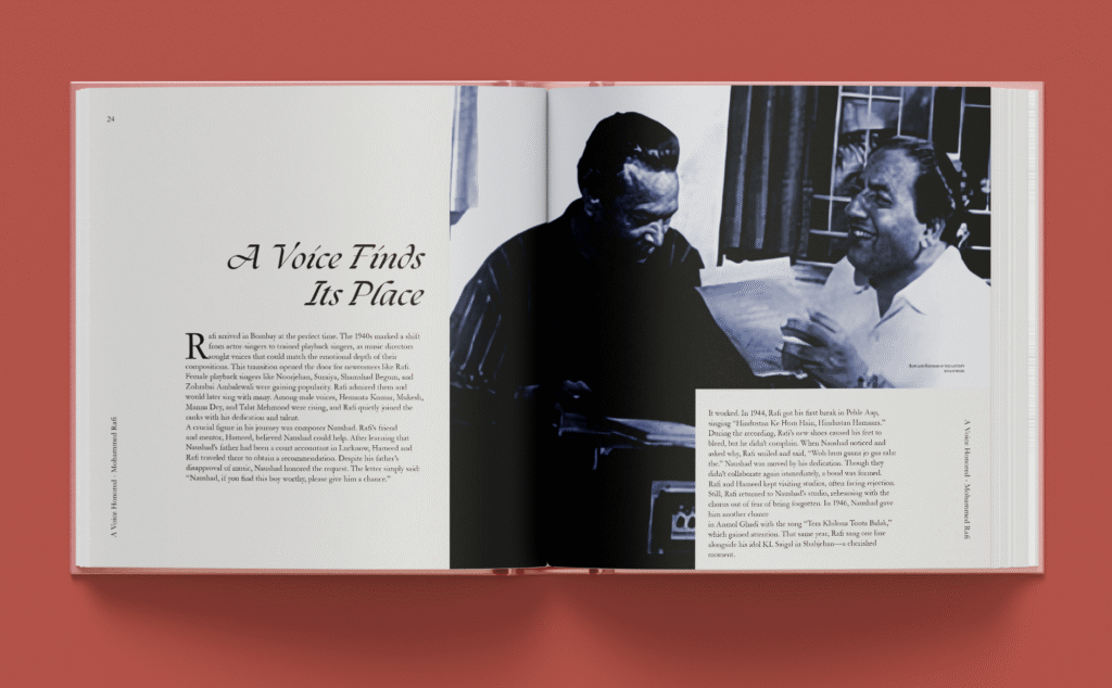
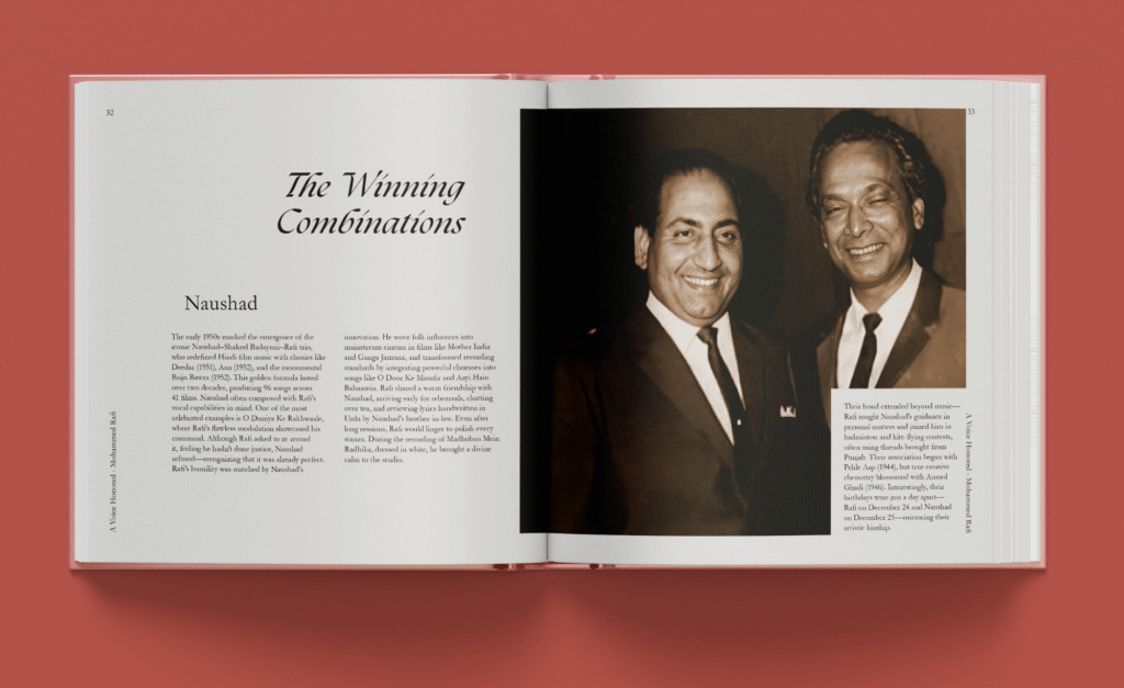
Monochromatic photographs of Rafi with people, in concerts, and in personal life were used. I also made illustrations to fill gaps where photos were not available and to add emotional feel. Calming tones of color were added that go well with monochrome photographs. I experimented with both symmetrical and asymmetrical layouts. Symmetry gave balance and neatness while asymmetry added energy, which I related to music flow.
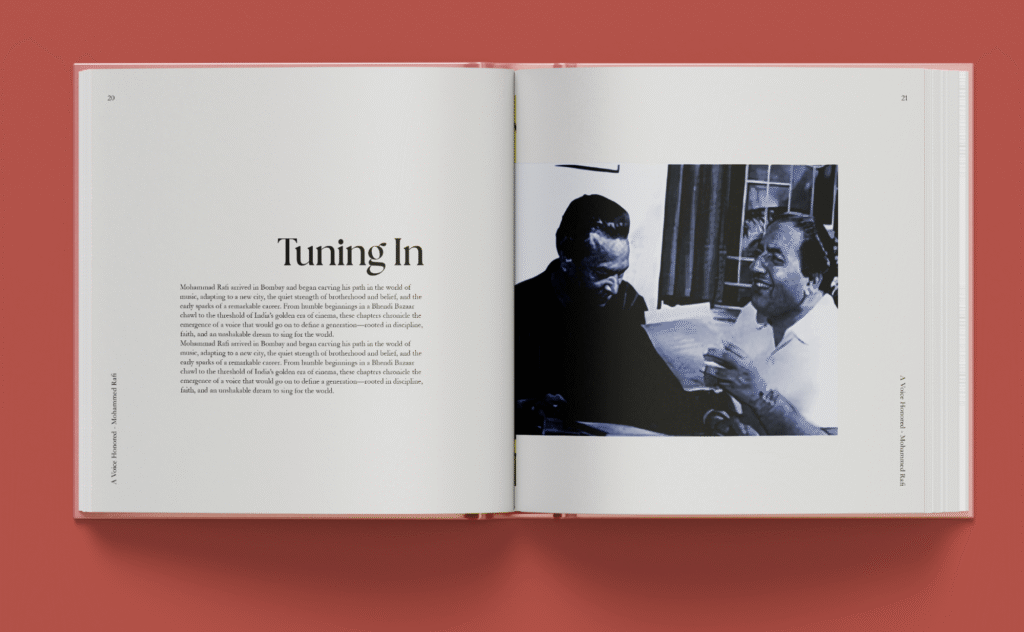
The final outcome consists of around 50 pages in total. The sections move smoothly with text and images placed together, supported by quotes and illustrations. Old photographs were integrated directly into the layout instead of being pushed to the back. Illustrations were used in some places where photographs weren’t available. Quotes from friends and people from the industry gave personal touch.